Modular interfaces, unified logic.
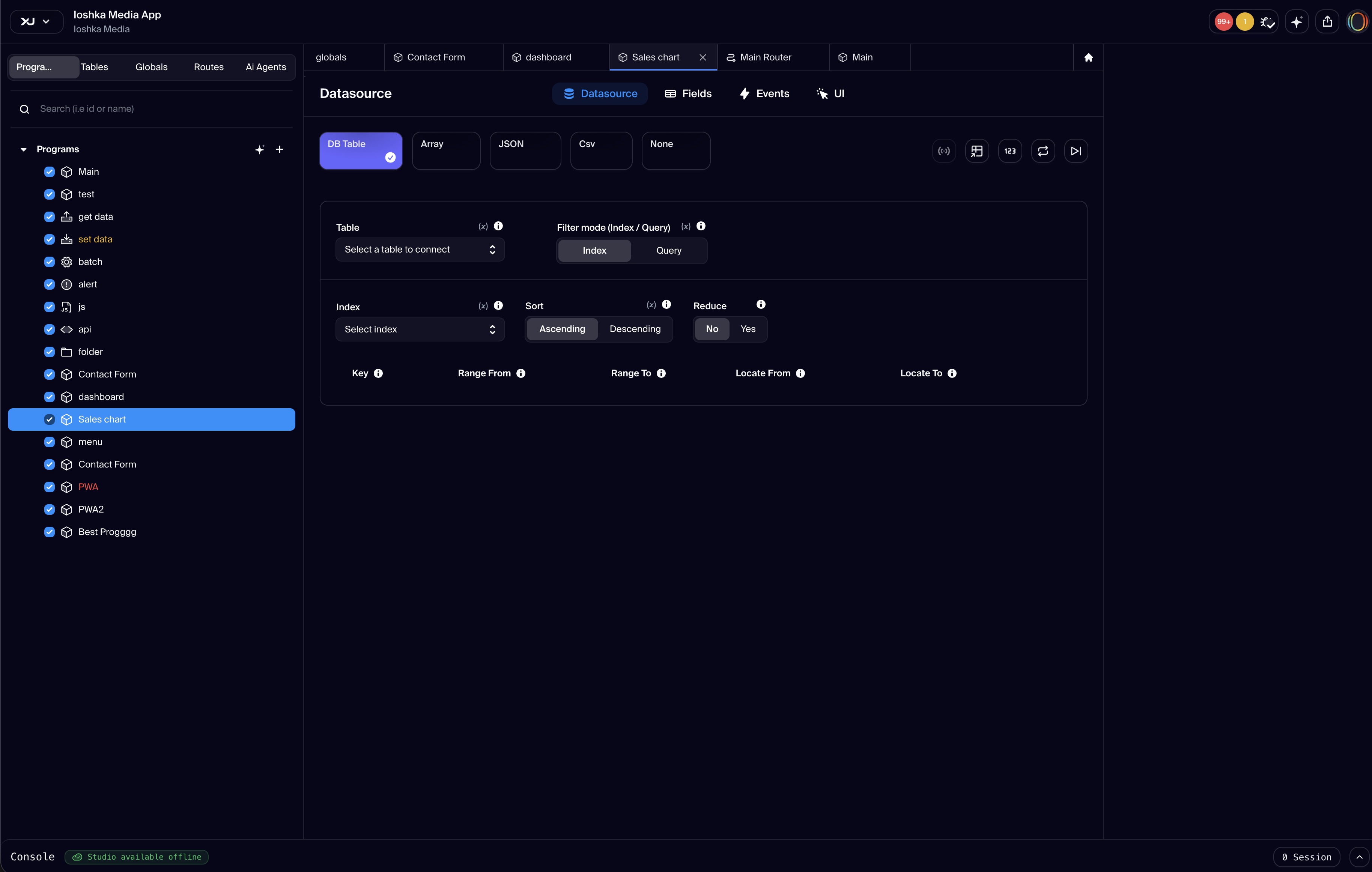
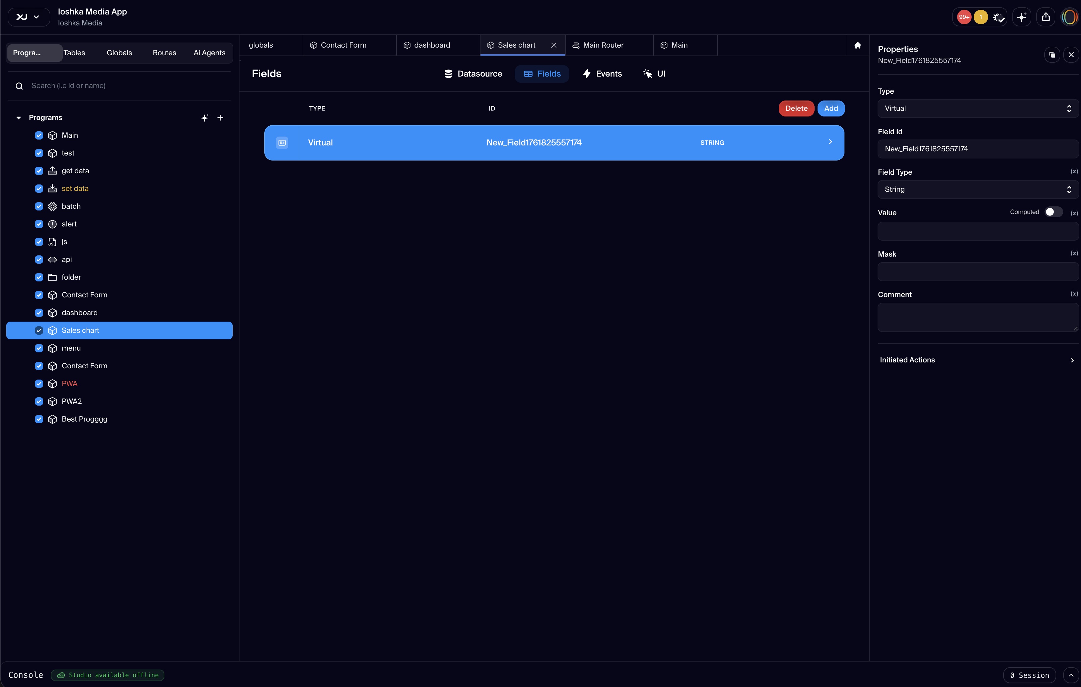
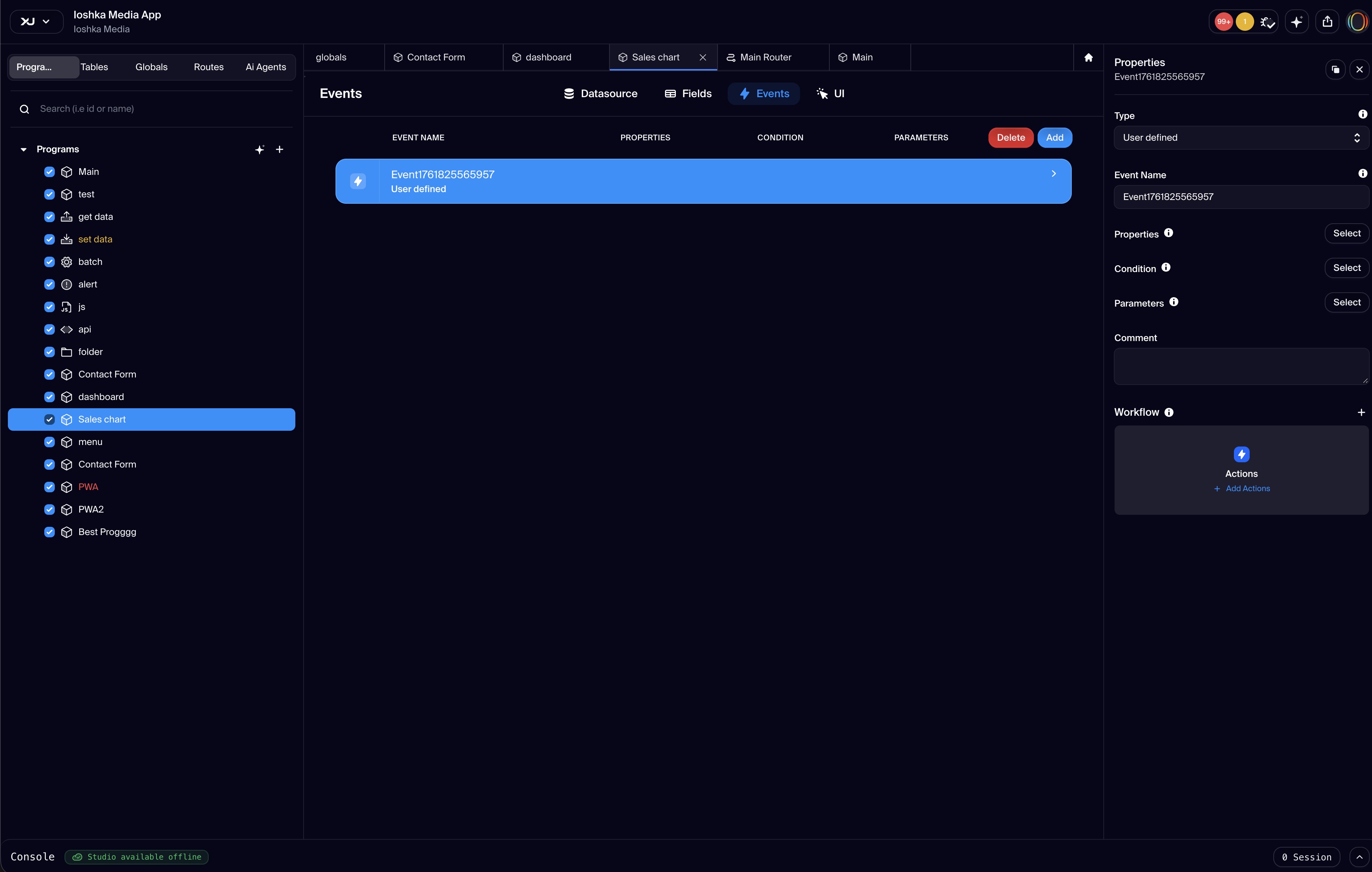
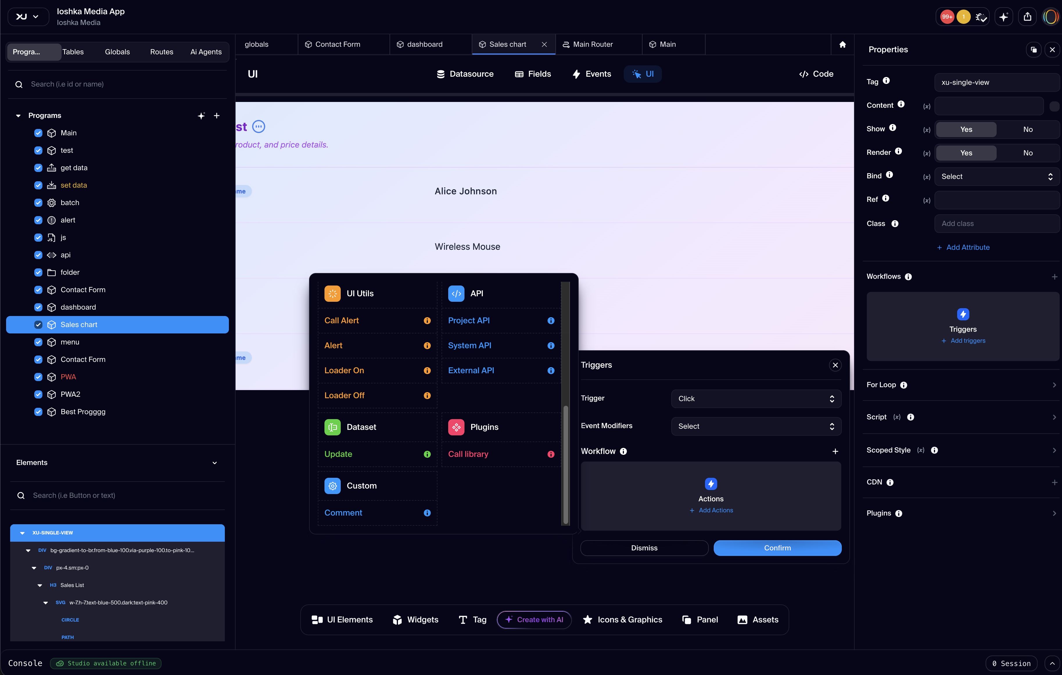
The Component is a program-level interactive unit in Xuda that brings together data, logic, and user interface in one reusable module. It acts as a self-contained block that manages both what users see and how the system responds, making it ideal for building dynamic interfaces and functional application flows. Each component can connect to data sources like internal tables or external services, define custom fields and variables for business logic, and embed event-driven functions such as lifecycle hooks or user-triggered actions. The user interface is built using a JSON structure inspired by Himalaya.js, allowing each element to include behavior settings like visibility rules, bindings, conditional rendering, and embedded scripts or plugins. Input and output parameters are handled through a built-in interface that lets the component receive data from other parts of the app and return responses dynamically. This makes components highly flexible and context-aware. Components can be triggered in several ways, such as opening through a route or URL, displaying as a modal or popover, or being embedded as a panel inside another view. This flexibility makes them easy to reuse, compose, and render wherever needed in the application. Whether you’re building a full page, a form, or a dashboard widget, components are the foundation for creating rich, interactive experiences within the Xuda low-code environment.
Available in plans
- free
- pro
- team
- agency
- enterprise
FAQs
Develop. Deploy. Stay Productive.
Xuda is the platform for frontend developers, providing the speed and reliability innovators need to create at the moment of inspiration.